In today’s digital age, a well-designed and user-friendly website is crucial for the success of your vacation rental business. Your website acts as the online storefront, enticing potential guests and making bookings a breeze. Furthermore, to help you create an effective vacation rental website, we’ve compiled a list of must-follow do’s and don’ts of vacation rental websites. From captivating visuals to seamless booking experiences, we’ve got you covered. So, let’s dive in and unlock the secrets to an unforgettable user experience that will skyrocket your bookings!
Table of Contents
The Do’s of a Vacation Rental Website
1. Do Focus on Clear and Intuitive Navigation
One of the key elements of a successful vacation rental website is an easy-to-use navigation menu. Ensure that it is clear, logical, and right in the spotlight. Make it effortless for visitors to find important information such as property listings, availability, pricing, and booking details. A navigation menu that’s a joy to use keeps potential guests engaged and longing to explore more on the website.
2. Do Utilise High-Quality and Engaging Visuals
Prepare to dazzle your audience! Embrace the power of stunning visuals that capture the heart and imagination. Utilise professional, high-resolution photos that showcase your vacation rental properties from various angles. From captivating interiors to breathtaking exteriors, and all those delightful amenities in between – leave no stone unturned. Moreover, don’t forget to showcase nearby attractions, giving guests a sneak peek into unforgettable experiences.
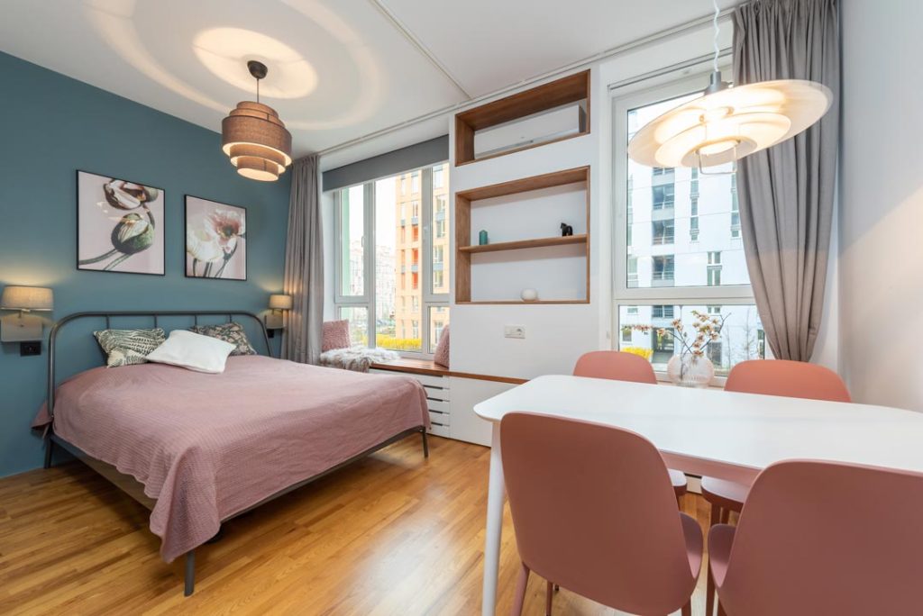
3. Do Provide Detailed Property Information
Transparency and accuracy are essential when it comes to property information. There is a reason they have made it through Do’s and Don’ts of vacation rental websites. Provide comprehensive details for each rental property, including accurate descriptions, amenities, room configurations, and any unique features. Present potential guests with a delightful narrative about each property, one that transports them to a world of comfort and charm. And don’t stop there! Offer insights into the location, nearby attractions, and convenient transportation options. Leave no question unanswered.
4. Do Incorporate an Availability Calendar and a Booking System
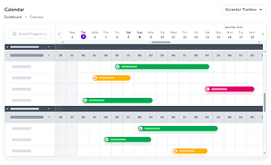
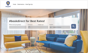
Don’t keep your guests waiting. An up-to-date availability calendar is a must-have feature on your website. Additionally, it allows potential guests to quickly check if the property is available for their desired dates. Implement a secure and user-friendly booking system that simplifies the reservation process. Enable guests to check availability, select dates, and complete the booking seamlessly. A streamlined booking system encourages conversions and boosts your bookings.
5. Do Showcase Guest Reviews and Testimonials
It’s time to turn up the trust factor! Social proof is a powerful tool to build trust and credibility. Incorporate guest reviews and testimonials on your website. Let their positive experiences speak volumes and turn browsers into bookers. Genuine reviews play a significant role in influencing the decision-making process. So showcase those positive vibes for all to see. Build trust, instil confidence, and watch the reservations flood in.

6. Do Identify Clear Cancellation Policies
Outline clear and transparent cancellation policies on your vacation rental website to establish trust and provide guests with peace of mind. Your cancellation policies should cover aspects such as the deadline for cancellations, any fees or penalties associated with cancellations, and any exceptions or special circumstances that may apply. For example, you may have different cancellation policies for the peak season or holiday bookings compared to off-peak periods.
Now, let’s navigate through the don’ts and avoid the pitfalls:
The Don’ts of a Vacation Rental Website
When it comes to vacation rental websites, there are several common vacation rental mistakes to avoid, which ensure your website is effective and successful. Here are some key mistakes to steer clear of:
1. Don’t Overwhelm Visitors with Cluttered Design
Leave chaos at the door! Avoid cluttered and overwhelming website designs. Keep the layout clean, organised, and visually appealing. Ensure that your website is easy to navigate and that visitors can find the information they need quickly. A clutter-free website design sparks joy and invites guests to explore every corner.
Check out 9 Direct Booking Website Design Mistakes That Cost You Bookings!
2. Don’t Provide Incomplete Property Information
Understanding the do’s and don’ts can make a significant difference in your booking success. That being said, accuracy is paramount when presenting property information. Double-check all details to ensure accuracy and completeness. Besides, double-check and triple-check to avoid any incomplete or misleading details. Transparent and accurate property information builds trust with potential guests.
3. Don’t Complicate the Booking Process
Don’t make the booking process a marathon! Simplify the booking process as much as possible. A lengthy or complicated booking process can deter potential guests from completing their reservations. Streamline the steps, minimise form fields, and offer a user-friendly experience from start to finish. A seamless booking process is the passport to higher conversion rates and a flourishing business.

4. Don’t Neglect Responsiveness
Responsiveness is another vacation rental mistake to avoid. Optimise your vacation rental website to be responsive across different devices. Moreover, ensure that it looks and functions flawlessly on smartphones, tablets, and desktop. In today’s mobile-driven world, a responsive website is vital for capturing guests on the go.
5. Don’t Underestimate a Clear Call-to-Action
A strong call-to-action (CTA) is essential for guiding visitors towards the desired action, such as making a booking or enquiring about availability. Avoid a lack of clear CTAs or burying them within the website. Place prominent and visually appealing CTAs throughout your website to encourage conversions and bookings.
6. Don’t Overlook Slow Loading Times
Slow-loading websites can be frustrating for visitors and lead to a high bounce rate. Therefore, optimise your website’s loading speed by optimising images, minimising unnecessary plugins or scripts, and choosing a reliable hosting provider. A fast and responsive website enhances the user experience and encourages visitors to explore further.
To Wrap It Up
By following the do’s and don’ts of vacation rental websites, you’ll create a vacation rental website that captivates guests and drives bookings. From intuitive navigation to stunning visuals and a seamless booking experience, your website will be a magnet for potential guests.
So, unleash your creativity, implement these strategies, and watch your vacation rental business soar to new heights of success! You can always attempt to get your perfect vacation rental website from Zeevou. Sign up to Zeevou for free, simply import your Airbnb listings and have it converted to your free direct booking website. Don’t waste another minute!
