A direct booking website is an unignorable keystone to building a self-reliant lucrative rental business in 2022. However, not every website can attract travellers and convert them into bookers. Consequently, direct booking website design plays a pivotal role in setting up your vacation rental business for success.
Your efforts to drive more traffic to your website will fail to yield direct bookings unless your website’s user experience (UX) can effectively convert your visitors into bookers.
Your website is your business’s front door, so its appearance is considerably important. A poor web design will deter your potential guests and cripple your conversion rates. On the other hand, an exemplary user interface and an enjoyable on-site experience for your visitors will streamline bookings.
Improve your vacation rental bookings easily by avoiding these 9 direct booking website design mistakes.
Table of Contents
Bad Website Navigation
Users become irritated and leave your website when they have difficulty finding your availability or the essential information they need. Don’t confuse and frustrate your visitors while struggling to make a booking on your website which has no or a very poor structure or overcomplicated and unresponsive pages.
Create a better UX with a sitemap and build an intuitive and user-friendly website. Make your website accessible, compelling and easy to navigate to everyone regardless of their screen sizes, devices or the browsers they use.
Review the structure of your website and redesign your whole booking journey. Allow users to go back and forth to your different web pages smoothly, and don’t forget to include a well-functioning search box. Include precise contact details and an FAQ page where you can easily answer your target customers’ questions.

Low Loading Speed
Your loading speed not only influences your website’s search ranking but also has a significant impact on your user experience and your brand’s overall impression on your users. Users abandon websites which take a long time to load. The page speed also impacts the customers’ willingness to buy from an online retailer.
0-4 second load time can bear the best conversion rates, while sites taking more than 5 seconds to load can hit roughly half the conversion rate of a fast-loading website. Using lots of heavy codes like Javascript or Flash players and large images can ultimately slow down your pages’ loading time.
Measure your web pages speed using Google’s PageSpeed Insights. Diminish the unnecessary graphics, animations and external scripts, learn how to compress your images and videos and find out the best ways to improve your page speed.

Using Low-Quality Images
Remember that your website is designed for one primary purpose: showcasing your property(ies) to your potential guests and attracting direct bookings. Your photos are the first encounter your target guests have with your home virtually and the most basic criteria in their decision-making process. Although your listing description can also help you display your vacation rental to your guests, everything comes second to a powerful visual representation. Not all guests read listing descriptions entirely, but many of them view your property’s photos carefully. Therefore, lacklustre and outdated images can make the wrong first impression on your visitors in seconds.
You can display the comfort and the amenities of your property online, animate your brand, showcase your USPs (Unique Selling Propositions) and keep your visitors engaged on your website longer with alluring images on your homepage and throughout your site. As a result, when designing or redesigning your website, replacing your old images with new high-end photographs must be a top priority.

Not Being Mobile-Friendly
Mobile devices account for 63 percent of organic search engine visits in the US, and vacationers are becoming more dependent on their smartphones for travelling. Besides that, Millennials, the largest generation group in the U.S., are most likely to use a smartphone device to book travel. As a result, mobile optimisation must be a top priority in direct booking website design to address travellers’ new preferences.
Moreover, since Google has modified its mobile search algorithm to consider mobile-friendliness as an essential criterion for ranking, not being immediately usable on mobile will cost you visibility, and hence bookings. Moreover, a non-mobile-friendly website can’t provide a satisfactory user experience and is unlikely to make many conversions.
If you are not sure of your website’s performance on mobile, you can take Google’s mobile-friendly testing tool. This tool can quickly tell you whether or not your website is navigable by mobile users simply by pasting your URL into a search box. It also provides you with a screenshot of how the page looks on a smartphone screen and a list of recommendations to improve your mobile experience. Even if your website gets a relatively high mobile-optimised score, you still need to consider ways to enhance your mobile experience for your users.

Uneffective Call-to-Action Buttons
Call-to-Action (CTA) buttons are among the most critical elements in web page design as they stimulate user action. CTA buttons’ ultimate goal is to convert your visitors into bookers. As a result, you need to ensure that your call-to-actions are clear enough to grab your users’ attention and entice them to click.
Do your visitors have a clear idea of what your website is offering? Do they know where to click to go to the next step of your booking process? Have you used CTAs relevant to each page?
Having unclear and irrelevant CTAs that don’t give enough cues to website visitors or confusing visitors with multiple CTAs can make your visitors click away before they even enter the booking process. So, devote sufficient time to research and decide on the size, positioning, colour, style, button shape, the text and the wording of your CTA buttons to make them as clickable as possible.
A web page can have multiple call-to-action buttons. Sometimes, you need to offer a secondary action to convince the user to make a booking. For example, before clicking on the “Book Now” button, some users may need further information to make their final decision. A secondary button such as “View Photos,” “Check Availability,” or “Make an Enquiry” will smoothly lead them to your desired primary call to action.
Find out the best practices to make impressive call-to-action buttons that stand out and best display your value proposition. Testing is the only way to evaluate your CTA buttons. Do as much A/B testing as you can and measure the effectiveness of your small changes and tweaks until you get it right.
Not Being SEO-Friendly
Many of your potential guests use search engines like Google to find and book travel accommodation. But, in the highly competitive short-term rental market, only the first top search results can drive the most traffic. As a result, having a good SEO (Search Engine Optimisation) score is no longer an option but an unconditional must.
Poor SEO costs you high quality traffic and revenue and increased occupancy rate.
Learn and implement the latest vacation rental SEO tips and enhance your user experience to have your visitors spend more time on your website. Assure Google and other search engines that your website is valuable and helpful for their users, and it provides your visitors with the content they are looking for.
A Frustrating Booking Process
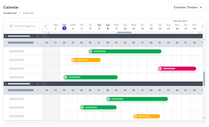
A direct booking website must always contain an availability calendar and a flawless booking engine. Your booking engine must guarantee a seamless, frustration-free and secure booking experience.
An inefficient, slow, or confusing booking process and any booking and calendar inaccuracy or friction will cost you bookings. This is why you must equip your website with an easy-to-use booking engine that can sync your calendars on different channels, to have a straightforward booking process. Include a clear, up-to-date pricing page to increase your price transparency and boost bookings.
Besides, booking systems or processes that look insecure deter your potential guests from booking a stay on your direct booking website. Guests need to be assured that their payment will be securely processed and their credit card details remain confidential.
Lacking Content
Your website visitors view your pages with particular questions in their minds. If your website fails to answer these questions and deliver the information they need, they leave your website with no point to return.
Craft an appealing vacation rental blog to attract more visitors to your website. Write quality blog posts on the most sought-after topics for your target guests to grow your business authority in the industry faster than your competition.
Modern travellers are driven to book based on not just what your vacation rental or serviced apartment offers; they also want to experience your destination like a local. Narrate meaningful local stories and motivate travellers to make extraordinary discoveries and remarkable adventures.
Remember that your content needs to be scannable by your audience. Use bullet points
and learn how to make correct use of whitespace to increase your blog’s clarity and focus. Find the right keywords for your vacation rental and implement SEO strategies to drive more traffic to your website.

Lack of Social Proof
Social proof is the evidence from your previous guests about their stay at your vacation home. It is proof of the quality of your service.
Not only does social proof add credibility to your website, but it also enhances your SEO. People trust online reviews when making bookings. Therefore, you can leverage the power of reviews, testimonials, success stories and case studies to attract potential leads and
drive more conversions.
Figure out what kind of social proof would appeal to your target guests can build trust in them and encourage them to make a booking. Ask your guests to give you their feedback on their stay at your rental and share them on your direct booking platform in the form of ratings, reviews, and testimonials. This way, you can strengthen your relationship with your previous guests and show that you care about your brand’s reputation.
Make use of User-Generated Content (UGC) and use the right hashtags to track your guest’s images and videos of your vacation rental on social media. Don’t forget to reach out to them to get their consent before sharing any of their content on your website.

Conclusion
Creating an attractive, easy-to-navigate direct booking website that converts visitors’ to bookers needs spending time and money. No matter the size of your direct booking website, lack of attention to details and making design mistakes can make your brand look unprofessional, frustrate your visitors and lower your conversion rates.
Try to define your value proposition on your website clearly. You have just a few seconds to capture your visitors’ attention when they land on your homepage or property page. If you fail to engage visitors, they’ll click away.
Remember, website design is not a one-off task. Visitors will be put off by a beautifully designed page that seems not to have been updated in ages. With platforms like LiveRez shutting down, many property managers are exploring alternatives to maintain seamless operations and direct bookings. Read about Liverez alternatives here to discover solutions that can help you transition smoothly.
An outdated direct booking website design can cost you conversions and make your users move to competitors. Pay close attention to every detail of your design and do a lot of testing to ensure everything functions properly.
